


2020 ChungChung Berry Brand Identity
2020 CHUNGCHUNG BERRY BRAND IDENTITY DESIGN
CLIENT : CHUNGCHUNG BERRY
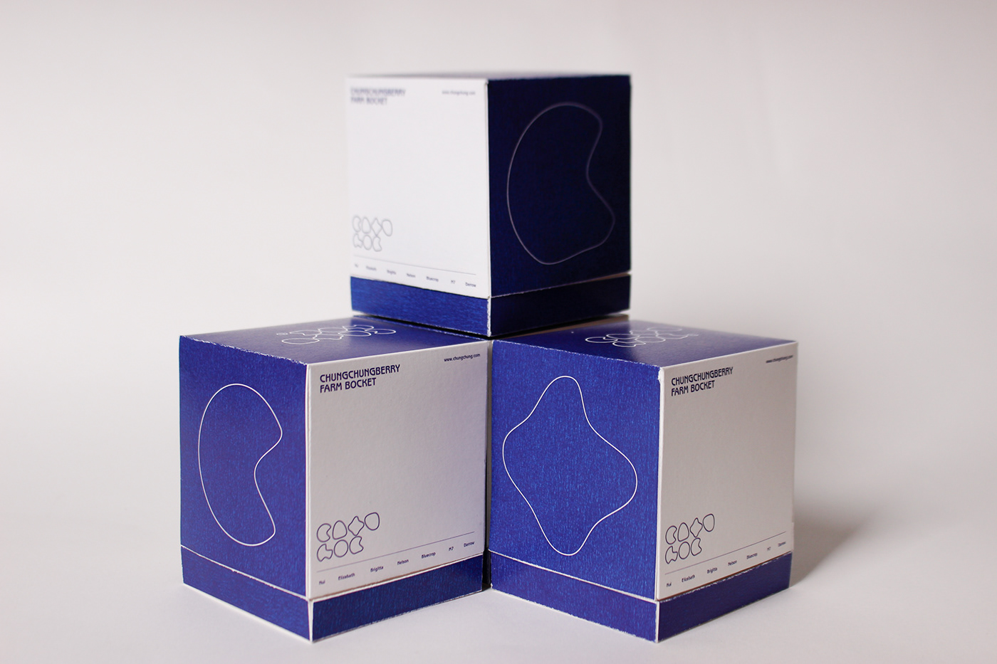
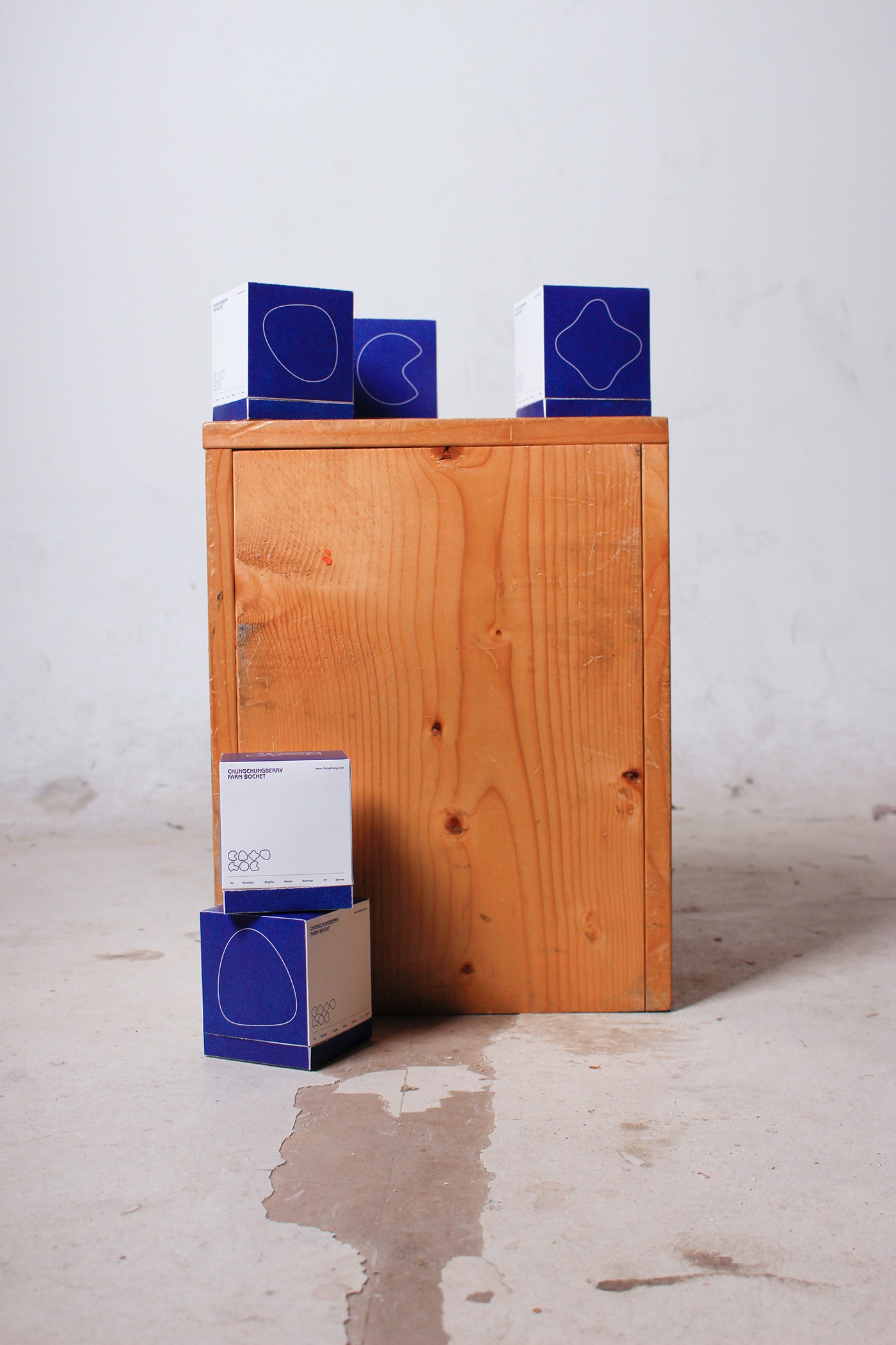
Chungchung Berry is a blueberry farm located in Hongseong-gun, Chungcheong-do, Korea. We changed the sales method that was done by selling acquaintances. While mainly selling online, the identity of Cheong Cheong Berry was required, and the identity of Cheong Cheong Berry was reinterpreted to create a new symbol and experience.


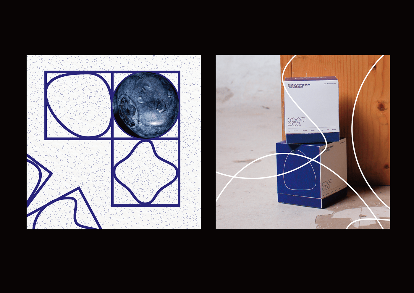
CHUNGCHUNG Blueberry is an organic blueberry brand. Blueberry means fresh blueberry, and it is a light blueberry seller that you can enjoy anytime. Under the slogan that the design is light and easy to enjoy, the 7 types of blueberries are simply expressed.

Chungchung berry has seven values. We have implemented differentiated identity by putting out different points from other blueberry farms. Each means Organic, Trust, Funny, Experience, Healthy, Taste, Quick.
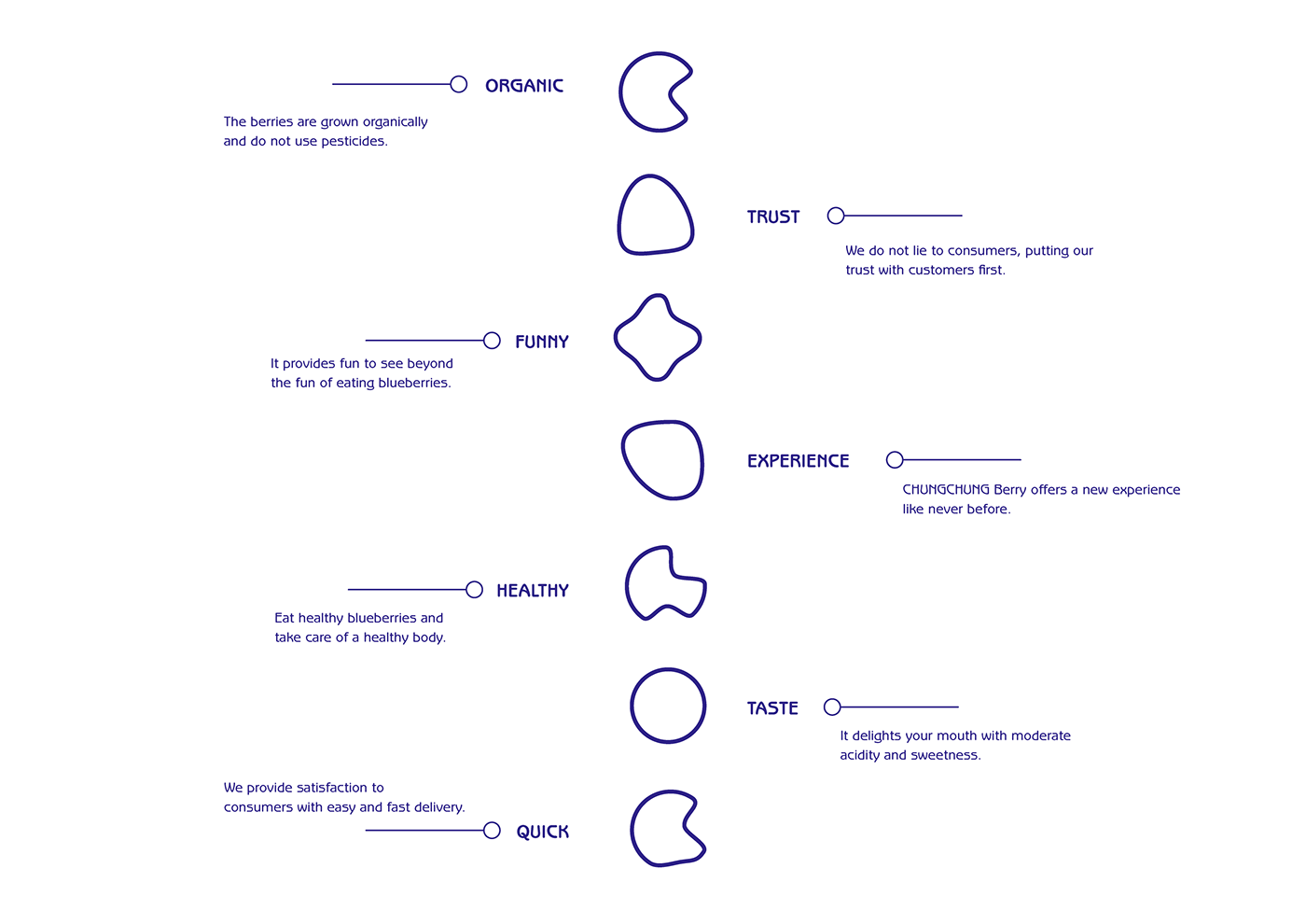
Design motifs are divided into three main categories. First of all, we focused on the form of blueberries, and we made up seven different shapes that were derived from it. After the overall design, we added colors to express our unique identity.

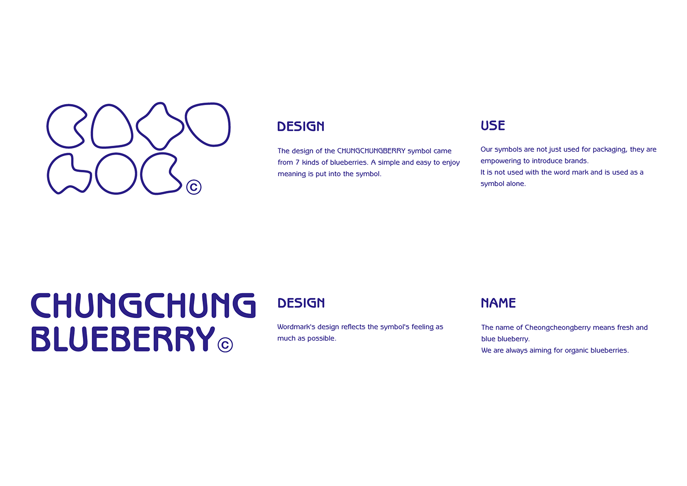

CHUNGCHUNG Blueberry is a brand that has a bouncing sweetness and fun. We looked for a curved typography to express this. The shape of the curve is reminiscent of blueberries.


Thank you for coming this. :)
Copyright Kim woo yong | 2020. All rights reserved.


